# 시각화 라이브러리
import matplotlib.pyplot as plt #pyplot 모듈 불러옴
import seaborn as sns
# 차트 그리기
plt.plot(data['Temp']) ->1차원 값
plt.plot('Date', 'Temp', data = data)
x축 : 인덱스
y축 : 1차원 값
- color=
- 'red','green','blue' ...
- 혹은 'r', 'g', 'b', ...
- https://matplotlib.org/stable/gallery/color/named_colors.html
- linestyle=
- 'solid', 'dashed', 'dashdot', 'dotted'
- 혹은 '-' , '--' , '-.' , ':'
- marker=
List of named colors — Matplotlib 3.7.2 documentation
List of named colors This plots a list of the named colors supported in matplotlib. For more information on colors in matplotlib see Helper Function for Plotting First we define a helper function for making a table of colors, then we use it on some common
matplotlib.org
| "." | point |
| "," | pixel |
| "o" | circle |
| "v" | triangle_down |
| "^" | triangle_up |
| "<" | triangle_left |
| ">" | triangle_right |
| "s" | sqare |
plt.plot(data['Date'], data['Ozone']
         ,color='green'                # 칼러
         , linestyle='dotted'          # 라인스타일
         , marker='o')                 # 값 마커(모양양)

plt.xticks(rotation = 30)       # x축 값 꾸미기 : 방향을 30도 틀어서
plt.xlabel('Date')              # x축 이름 지정
plt.ylabel('Ozone')             # y축 이름 지정
plt.title('Daily Airquality')   # 타이틀

plt.show()
범례
plt.plot(data['Date'], data['Ozone'], label = 'Ozone') # label = : 범례추가를 위한 레이블값
plt.plot(data['Date'], data['Temp'], label = 'Temp')
plt.legend(loc = 'upper right') # 레이블 표시하기. loc = : 위치 조절 (best, upper right, upper left, lower left)
plt.grid() #깔끔하게 선 그려줘
plt.show()
* () 괄호에 대고 shift + tab 누르면 괄호 안에 어떤 인수 들어가는지 볼 수 있음
참고자료
https://matplotlib.org/stable/api/_as_gen/matplotlib.pyplot.plot.html
matplotlib.pyplot.plot — Matplotlib 3.7.2 documentation
An object with labelled data. If given, provide the label names to plot in x and y. Note Technically there's a slight ambiguity in calls where the second label is a valid fmt. plot('n', 'o', data=obj) could be plt(x, y) or plt(y, fmt). In such cases, the f
matplotlib.org
https://pandas.pydata.org/docs/reference/api/pandas.DataFrame.plot.html
pandas.DataFrame.plot — pandas 2.0.3 documentation
sequence of iterables of column labels: Create a subplot for each group of columns. For example [(‘a’, ‘c’), (‘b’, ‘d’)] will create 2 subplots: one with columns ‘a’ and ‘c’, and one with columns ‘b’ and ‘d’. Remaining colum
pandas.pydata.org
#그래프 크기(생략가능)
plt.figure(figsize=(12,8)) #default size는 6.4, 4.4
#그래프 그리기
plt.plot('Date','Ozone',data=data,label='Ozone')
plt.plot('Date','Temp',data=data,label='Temp')
plt.plot('Date','Wind',data=data,label='Wind')
#꾸미기(생략가능)
plt.xlabel('Date')
plt.title('Airquality')
plt.legend(loc='upper right')
plt.grid()
#마무리(생략가능, 주의!)
plt.show()
+ 여러 그래프 나눠서 그리기
-> plt.subplot(row, column, index)

- row : 고정된 행 수
- column : 고정된 열 수
- index : 순서
plt.figure(figsize = (12,8))
plt.subplot(3,1,1) #subplot(row, column, index) 3행 1열의 첫번째 그래프
plt.plot('Date', 'Temp', data = data)
plt.grid() #꾸미는 것은 각각 해야함
plt.subplot(3,1,2) #3행 1열의 두번째 그래프
plt.plot('Date', 'Wind', data = data)
plt.grid()
plt.subplot(3,1,3) #3행 1열의 세번째 그래프
plt.plot('Date', 'Ozone', data = data)
plt.grid()
plt.ylabel('Ozone')
plt.tight_layout() # 그래프간 간격을 적절히 맞추기, 여백 줄이는
plt.show()
* plt.subplot(3,1,1) -> 위 아래로 (3행 1열) 그래프 그리기
plt.subplot(1,3,1) -> 옆으로 (1행 3열) 그래프 그리기

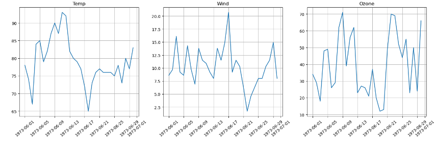
# 전체: 1행 2열
# 전체 크기 지정
plt.figure(figsize = (15,5))
plt.subplot(1,2,1)
# 1) x='Date',y='Ozone'
plt.plot('Date', 'Ozone', data = data)
plt.title('Ozone')
plt.grid()
# 2) x='Date',y='Wind'
plt.subplot(1,2,2)
plt.plot('Date', 'Wind', data = data)
plt.title('Wind')
plt.grid()
#마무리
plt.tight_layout()
plt.show()
'데이터 분석' 카테고리의 다른 글
| 데이터 전처리 (1) | 2023.10.29 |
|---|---|
| 시계열 데이터 처리 (0) | 2023.08.19 |
| 데이터 축소 - 특징 선택 (0) | 2023.08.02 |
| 데이터 변환 - 특징 생성 (0) | 2023.08.02 |
| 데이터 변환 - 정규화, 구간화 (0) | 2023.08.02 |
